When I setup this blog back in 2005 I had just graduated from college and most of my development experience at the time was in Java, but I had taken a job as an ASP.NET developer. When I setup the blog I didn’t know that much about web development. Last week Doug Rathbone let me know he was having issues viewing my site. This led me to take a closer look at my blog and I have to say that I’m embarrassed by what I found. I should have made the improvements outlined in this post a long time ago. In the long term I’d like to move off of dasBlog but I haven’t had the time to do that, but I needed to do something. I think I’m in a much better place, and wanted to share what I did. Before that let me recap what problems I discovered.
Poor performance
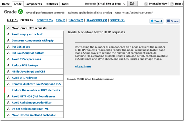
By far the most egregious aspect of my blog was it poor performance. I was violating every rule in the book! Ok well maybe not every rule as I somehow received a B rating in YSlow. After running YSlow with the Small Site or Blog settings on the site here were the results.
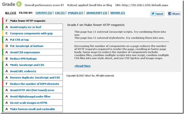
I was making too many http requests which was killing my site. Some of the request were for images in the content but from static content I had the following.
- 11 css files
- 11 JavaScript files
- 1 swf file to facilitate copy to clipboard
- Bunch of small images for styling
Step: Reduce the startup time of the page
My pages were loading slowly, and for the most part un-necessarily. Two things that my site had which were slowing it down were the .js files are imported at the top of the page and un-needed ads showing content. I moved all the .js includes to the bottom of the page which helped the startup time. I also simply removed the ads.
Step: Reduce the number of http request
In total there were 65 requests, not all to my webserver but most of them. The .css files were mostly for the various webparts used by the theme and the generic dasBlog .css files. Many of the .js files were brushes for the syntax highlighter that I use. To take care of this I decided to update the way that my blog looked to avoid the un-necessary images used for styling. After that I removed the un-used .css files from the site template.
Then I downloaded Packer .NET. I used that to compress and combine all the .css files into a single minified .css file for the entire site. I had to update some relative paths in the .css file but other than that it was pretty simple. I also used packer to do the same for the .js files.
Step: Reduce the size of the content being sent
Not only did I want to reduce the number of request going back and forth but I wanted to reduce the overall number of bytes going back and forth. When I was viewing the request going back in forth in my browser I noticed that a lot of .pngs were being sent back and forth because most of my entries have at least 1 image. So I downloaded PNGGauntlet to take care of it. I searched for all .png files in my site and drag tem to PNGGauntlet and let it optimize them for me. After running that I knew that all the images were optimized. I plan to run this tool on all new .png files ever few months. I post my blogs with Windows Live Writer and I haven’t researched if I can integrate this directly into it. I also changed the site’s layout to reduce the content of the web request itself. More on those changes later.
Poor readability
I’m not a designer or a fashion expert but even I could tell that my site was not laid out correctly. It had a lot of elements which were distracting, un-necessary and downright ugly. Below you’ll see thumbnails of how my blog looked like on a hi-res screen and a mid-res screen.
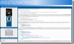
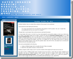
You can see that the left hand column is an offender in both cases equally. The title bar is taking ~10% of the page on the hi-res screen and on the mid-res screen ~35% WTF!!! The most important thing on any blog is the content and the site should be optimized for readers to view the content. Everything else is just a distraction. The column on the left hand side had to go and the title bar needed some serious work. From the content in the sidebar the only items which I liked were; search, link to months, posts on this page and the categories. Everything else pretty much sucked.
Here is what I did; updated the title to be way more compact and less verbose. Removed the sidebar with ads and links. I placed the verbose sidebar content which I did like at the bottom of the page with an anchor. I linked to that in the hearder, which is where I placed the search bar. Now the distracting header is hopefully no longer distracting and the sidebar went away entirely. But all useful functionality and content were preserved.
While doing this I also looked at the HTML content which was being rendered. There were some un-needed
Lack of mobile support
My site was completely unusable on a mobile device. Here are some screen shots of how my blogged looked on a mobile device.


If you ever visited my site on a mobile device, I apologize :(
Since I had already removed the columns and made the title much smaller I was already on my way. But I also needed to add the view port meta tag to the header of the site so that the browser would render the site in the correct way.
Even with the decreased title when viewed on a mobile device it was too large. I used a simple CSS media query to create styles when the site was viewed in narrow views.
@media only screen and (max-width:600px)
{
    /* Insert css here */
}
When testing this you can either download a mobile emulator, like Electric Plum, or simply resize your browser until it is less than the desired size. After the changes here are the screen shots of my new layout on a mobile device.


As you can see it’s much easier to see the contents of the entries. The title bar is still a bit big, but I’d have to have to shorten the text to make it smaller, but I’m OK with how it is currently.
View when docked in Windows 8
Then I looked at my site when it was docked on the left or right in Windows 8. Below is what my site looked like before any changes.
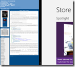
Not surprising, I thought it was gonna suck. Here was my site after the updates above.

To my surprise it still sucked! The problem here is a similar issue as to the mobile view. The device does not know the size to make the viewport. I had to add one line of css to enable my site to be rendered correctly.
@media screen and (max-width: 320px) {
@-ms-viewport { width: 320px; }
}
More info on this at http://blogs.msdn.com/b/ie/archive/2012/06/19/adapting-your-site-to-different-window-sizes.aspx. You can combine this with css media queries if you want to have finer grained control. More info on this at http://msdn.microsoft.com/en-us/library/ie/hh708740(v=vs.85).aspx. After that simple change here is what I now have. Much better.
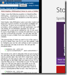
After that I did a bit of looking around to see what sites look like docked in windows 8, there are very few which actually look nice.
Good sites
Scott Hansleman’s site is very readable for Windows 8 when docked. Kudos Scott! This doesn’t surprise me at all for Scott.

Microsoft.com this site is optimized for being docked, which I would expect.

Bad sites
Mads Kristensen’s blog is completely unreadable without zooming.

Even top-tier sites are not usable on windows 8 when docked. They still have a few weeks to GA, but they will need to get this taken care of soon.
Facebook

Twitter

cnn.com

Not many sites ready for being docked in windows 8.
Conclusion
After all these changes m site loads much faster, looks way better and is much easier to read on a variety of devices. After all of these changes I was able to get my YSlow score up to 98. The only remaining issue is to reduce the number of DOM elements. In order to address that issue I’ll have to wait until I can upgrade my blog software. For now I’m happy with where I’m at.
One thing that I haven’t done yet is to set expires headers for all my static content. I’m planning to do this, but after I make some other updates first.
For those of you who have been reading my blog for a while, I’m sorry to put you through the pain I did :) But I’m hoping that things are much better now. If I missed anything else please let me know.
FYI Scott Hanselman has a good post discussing these topics at http://www.hanselman.com/blog/TheImportanceAndEaseOfMinifyingYourCSSAndJavaScriptAndOptimizingPNGsForYourBlogOrWebsite.aspx.
Thanks,
Sayed Ibrahim Hashimi | @SayedIHashimi




Comments are closed.